IdentityIdentity · Fast food brand
ONZ
Sandwiches & More
A bilingual fast-food brand built to be loud on a busy street: a swoosh wordmark, a burnt-orange system across every box and cup, arched wall graphics for the store, and AI-directed product photography for the menu and social.
Client
ONZ restaurant
Market
Saudi Arabia
My role
Identity, packaging, store graphics, menu, AI photography
01
The logo
Arabic and Latin set in one lock-up, with a swoosh that reads as speed.
02
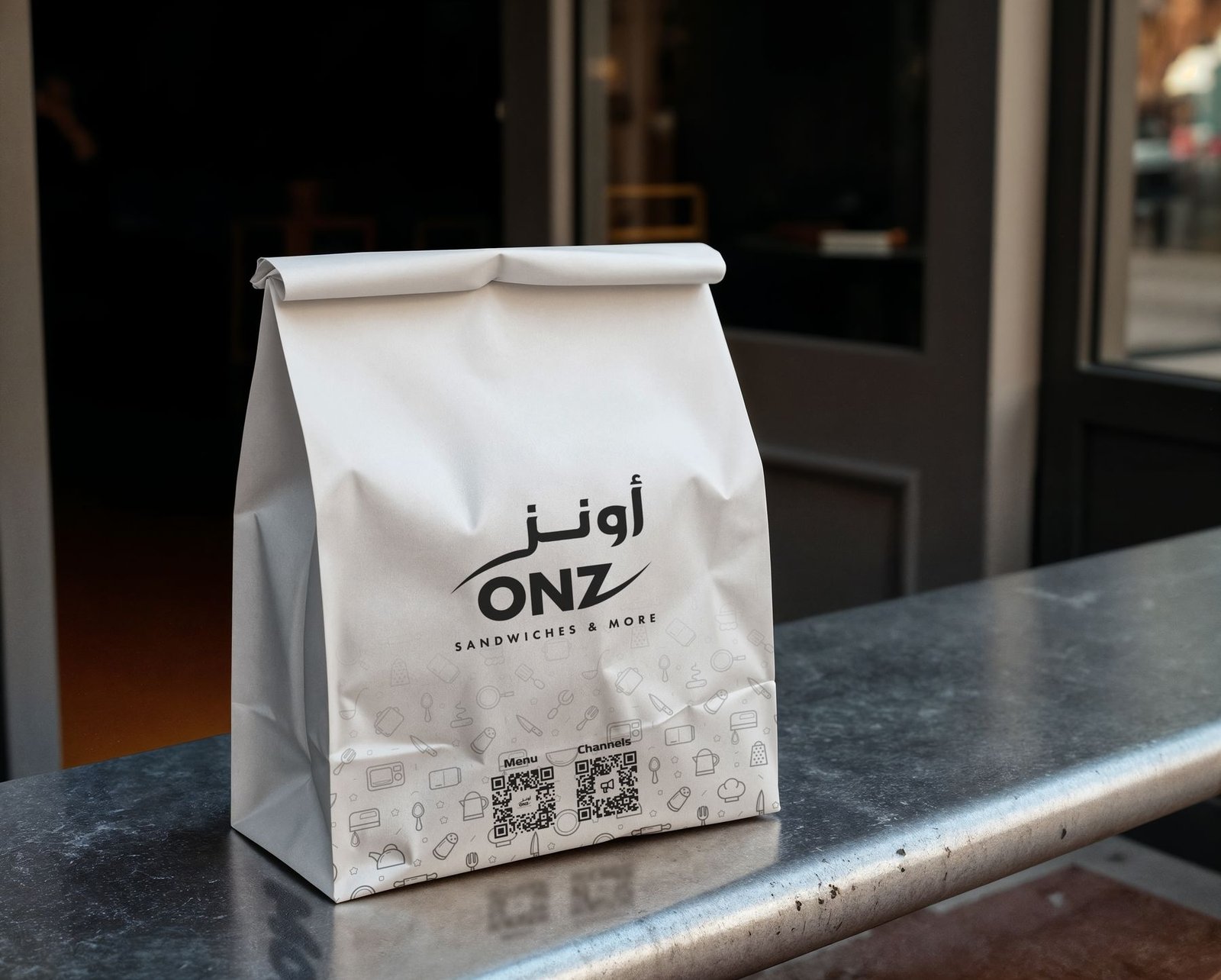
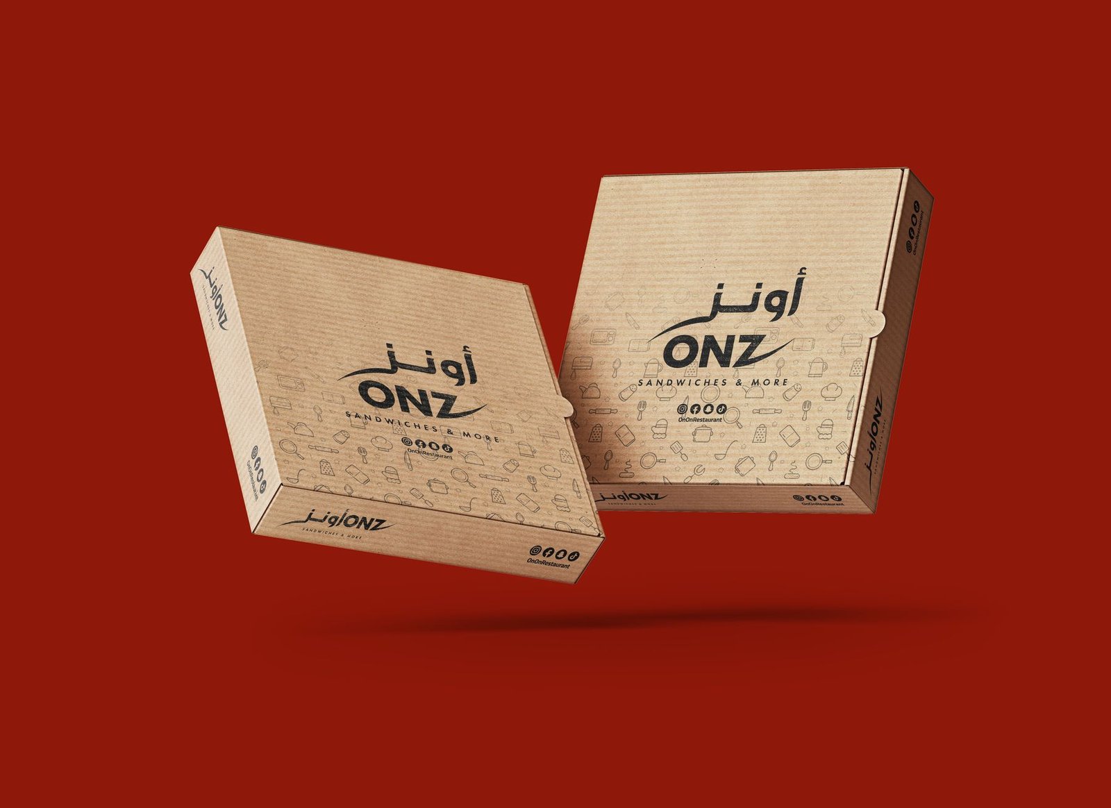
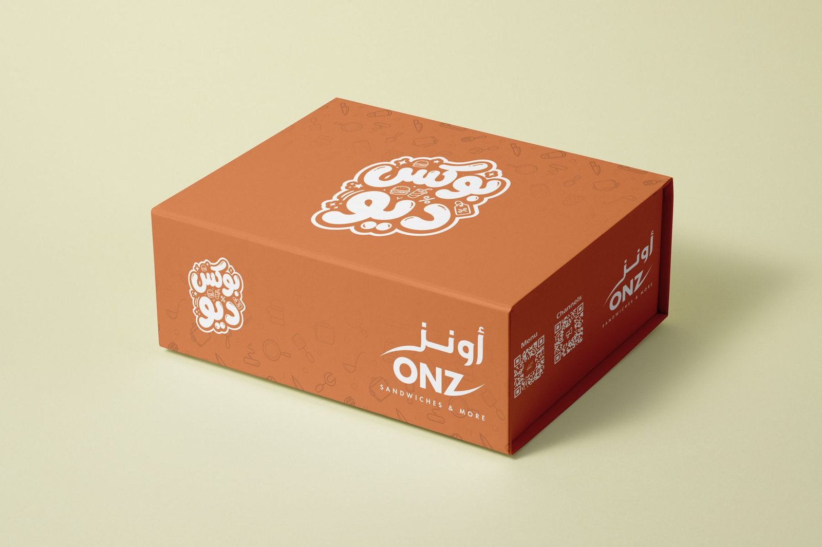
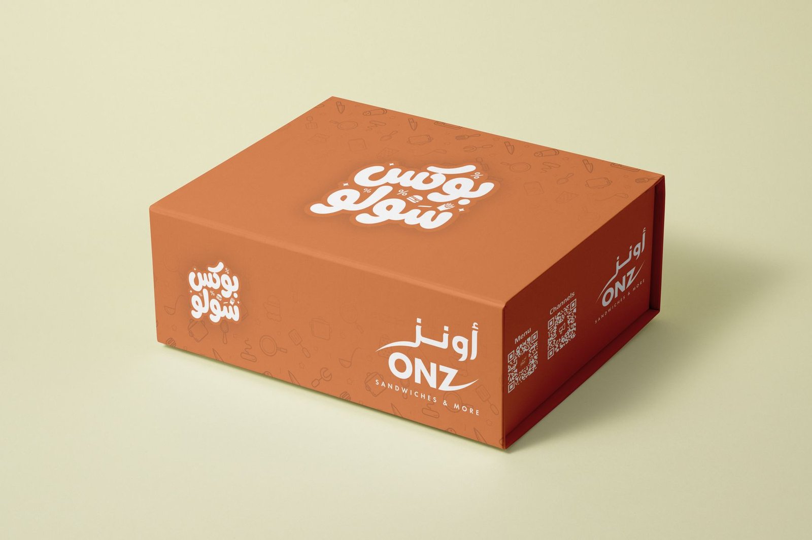
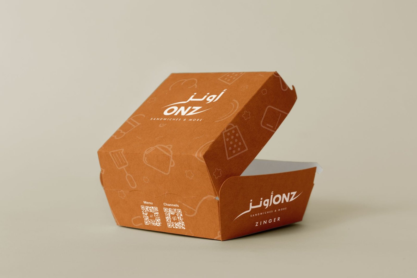
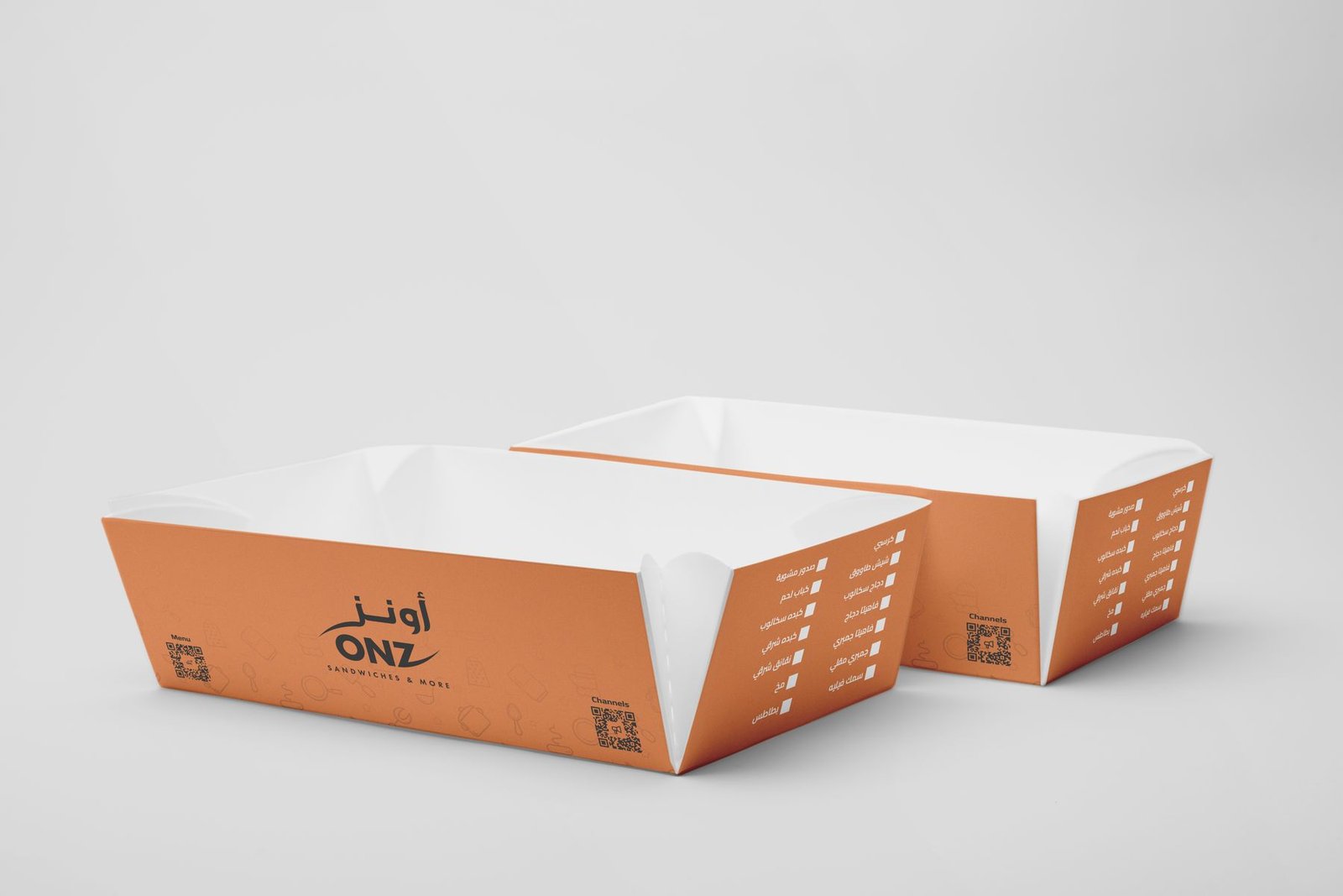
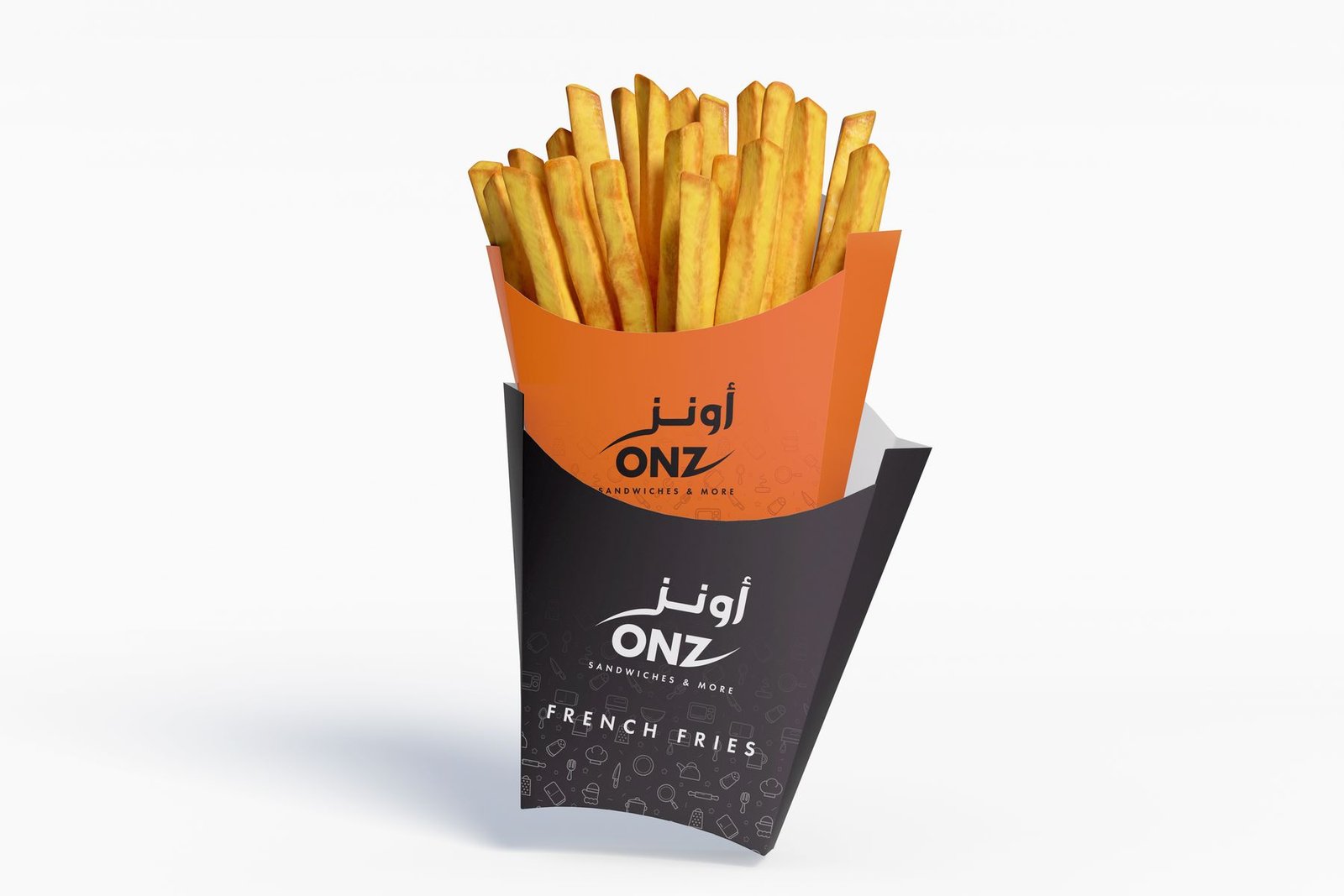
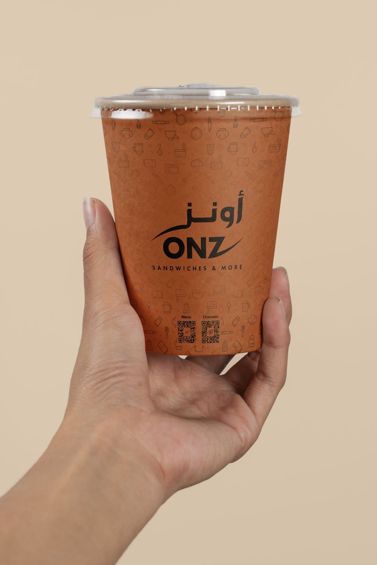
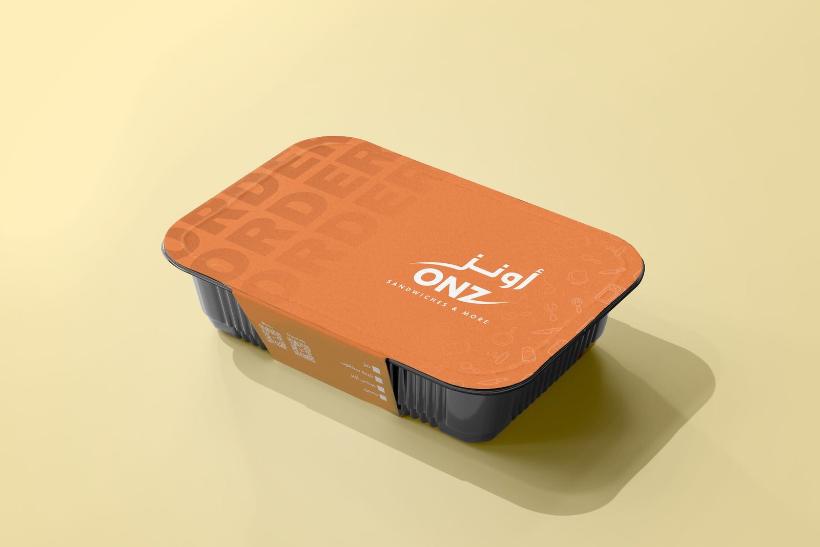
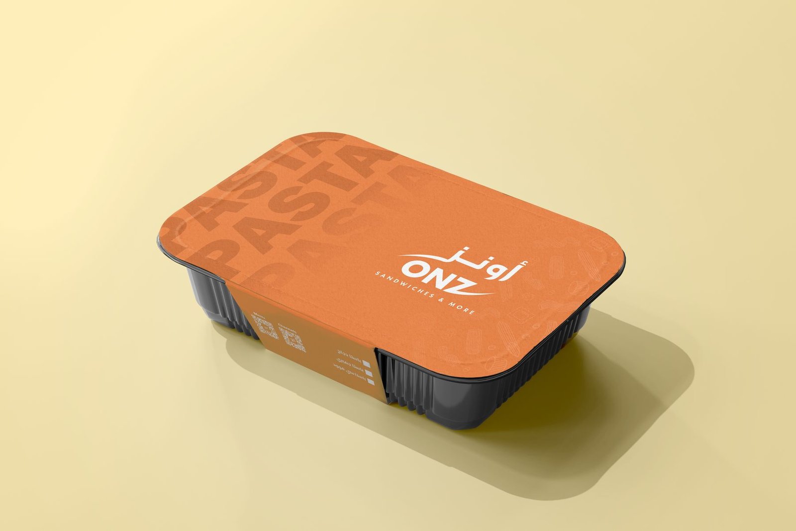
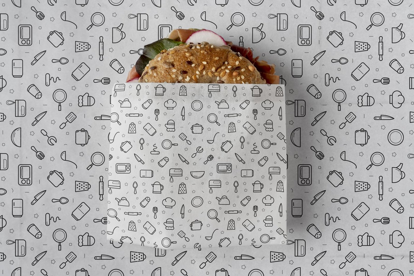
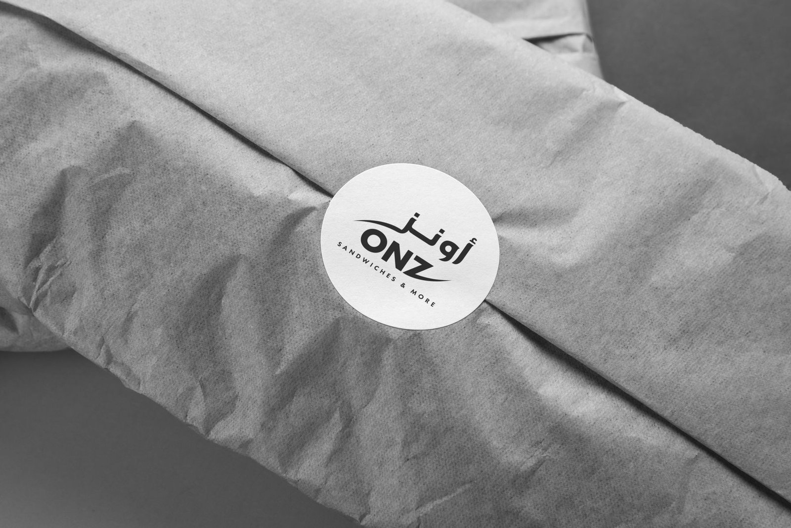
Packaging
Bags, boxes, wraps, cups and fries holders in one consistent system.
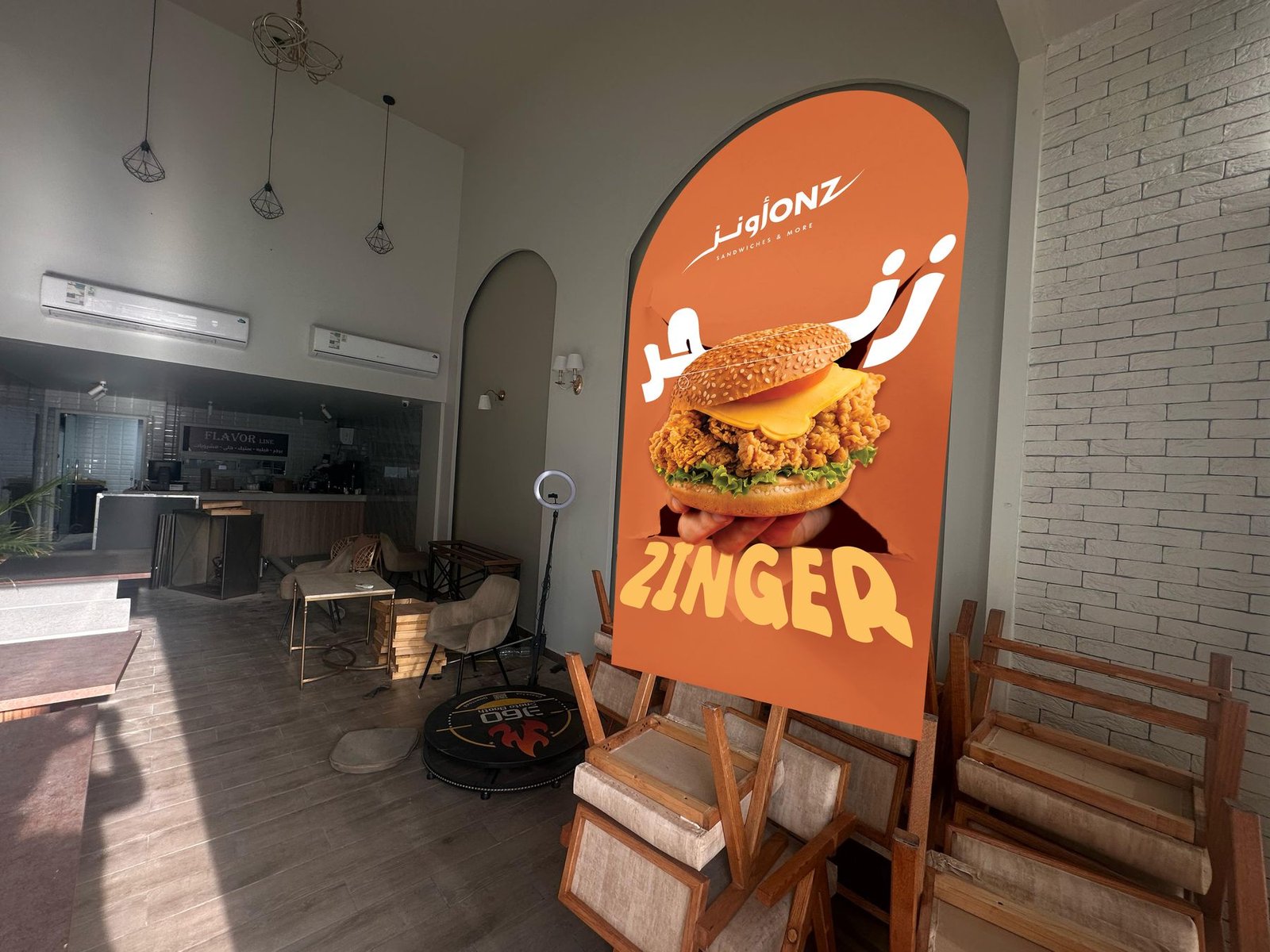
03
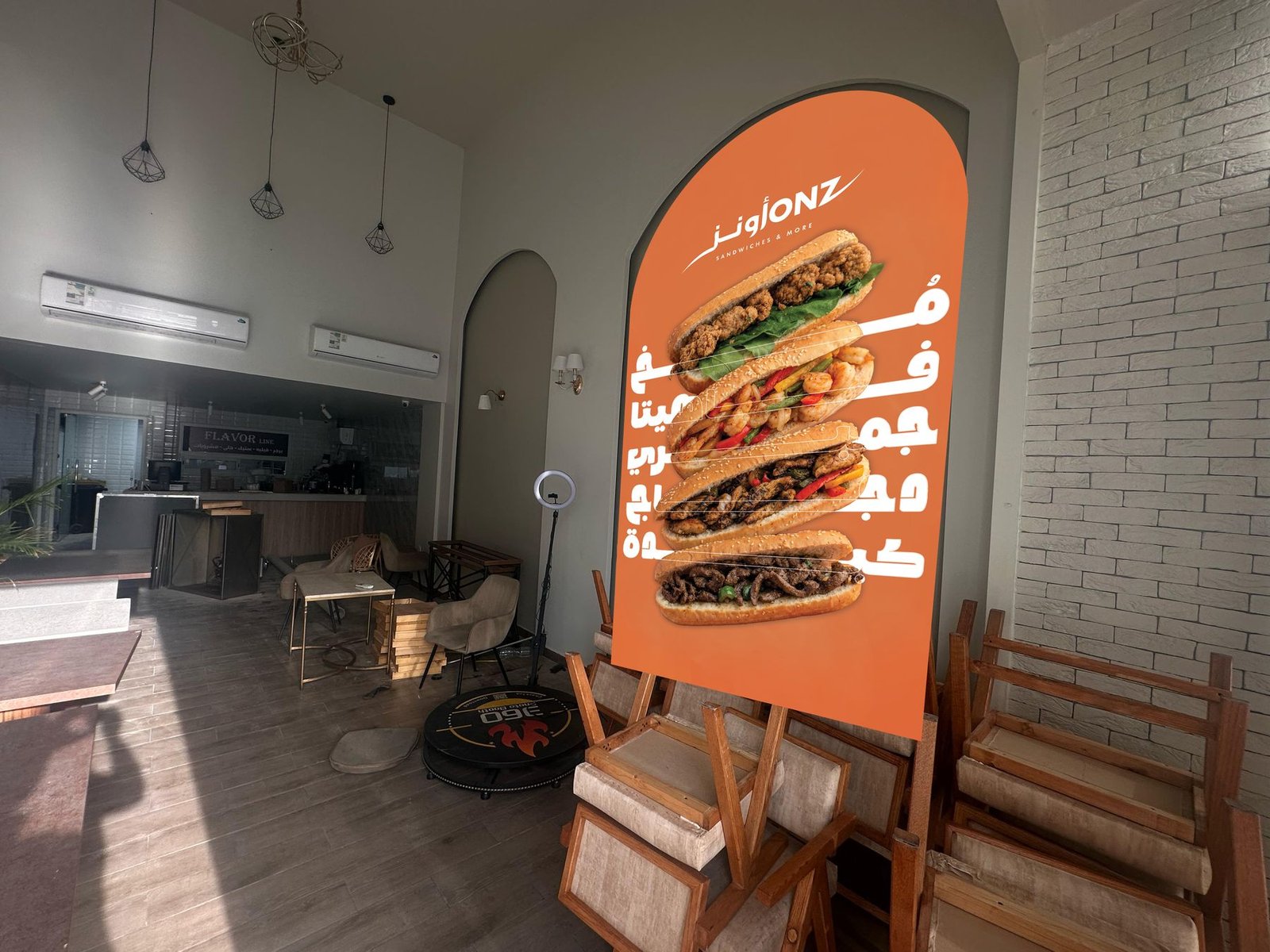
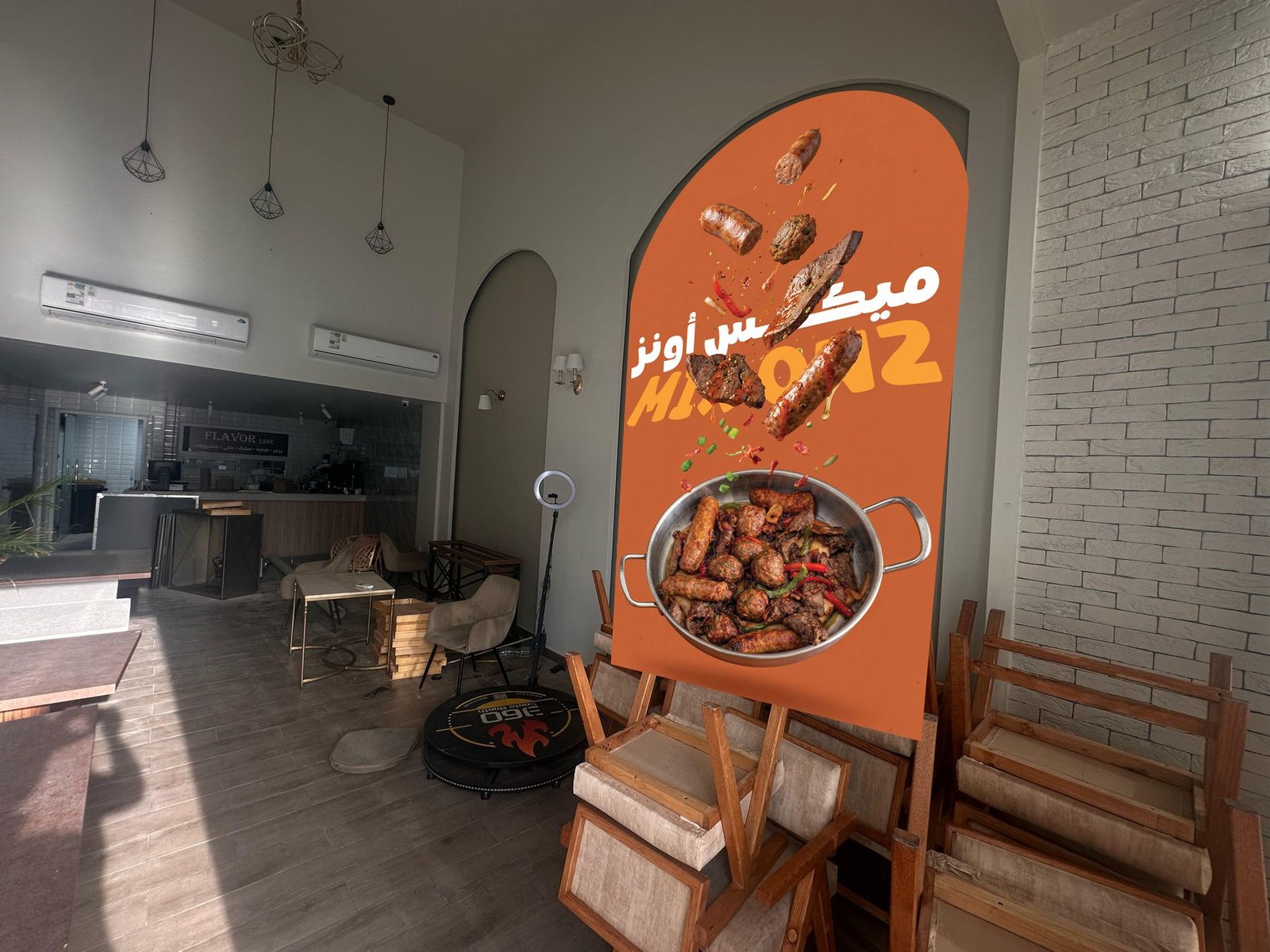
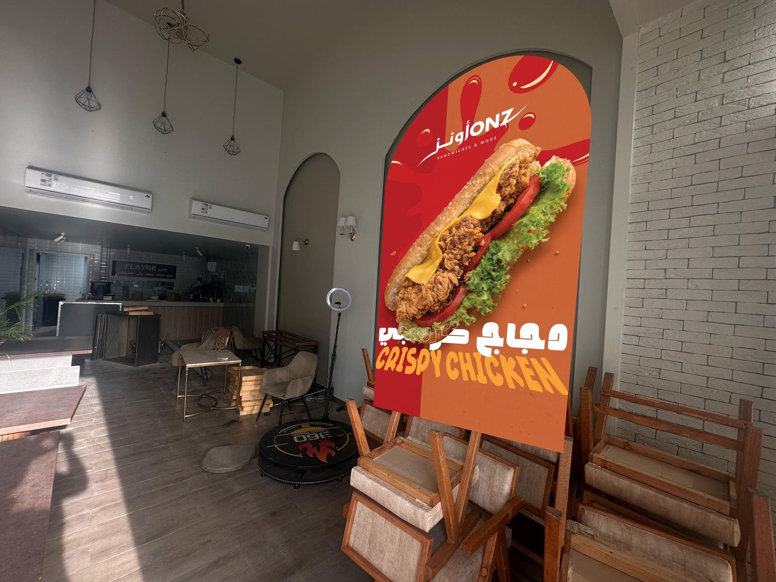
Store walls
Arched product walls for the dining area.
04
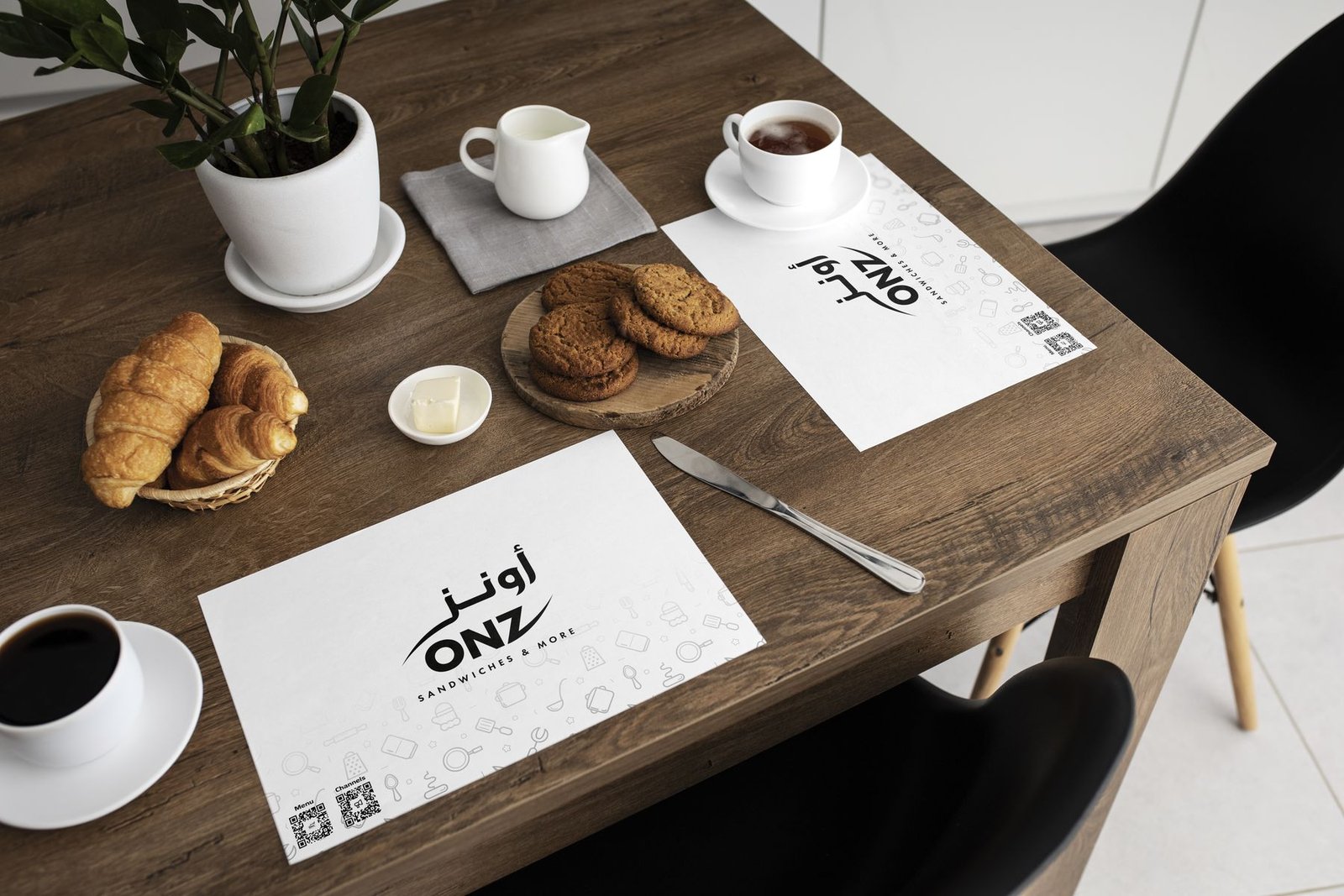
Placemat
05
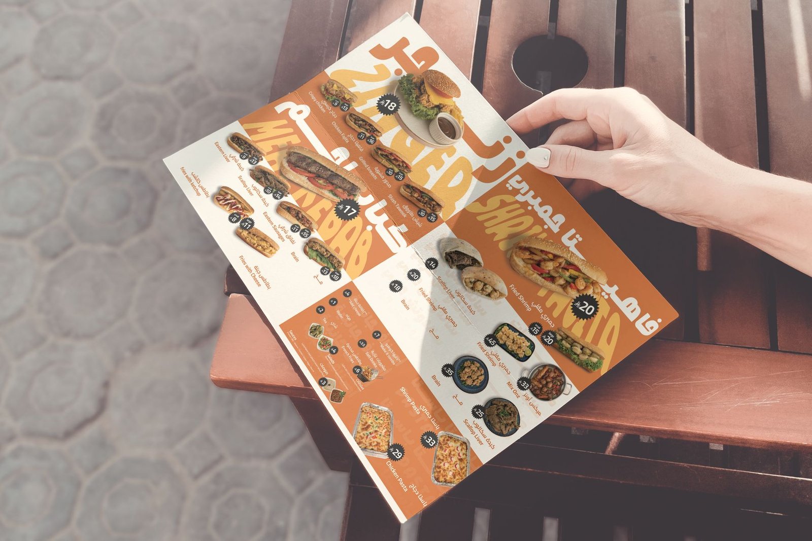
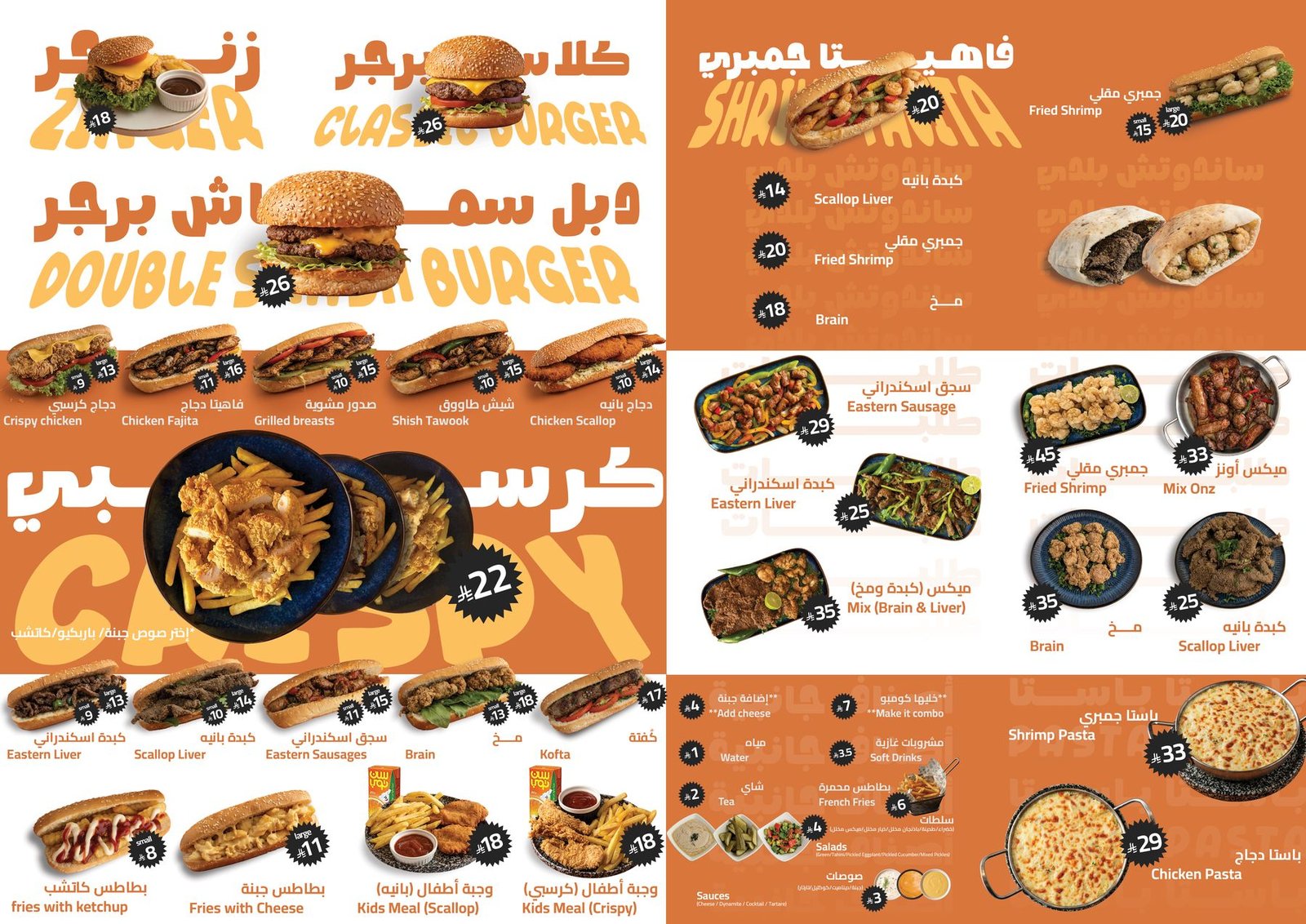
The menu
A high-energy menu board built for quick ordering.
06
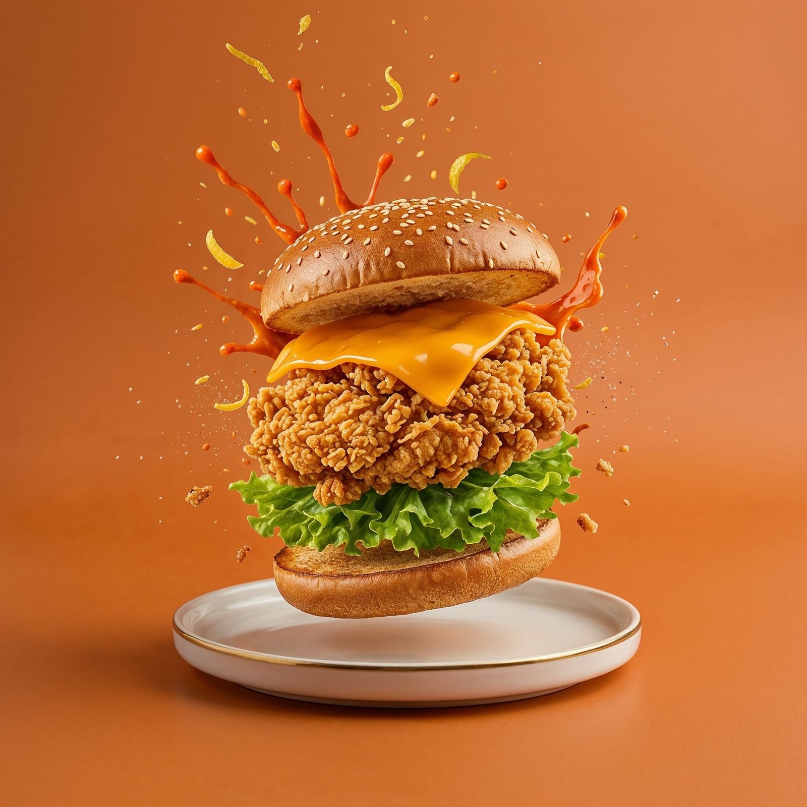
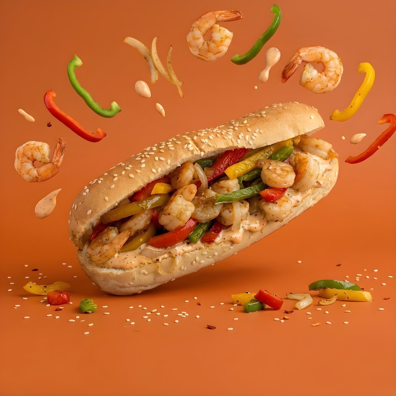
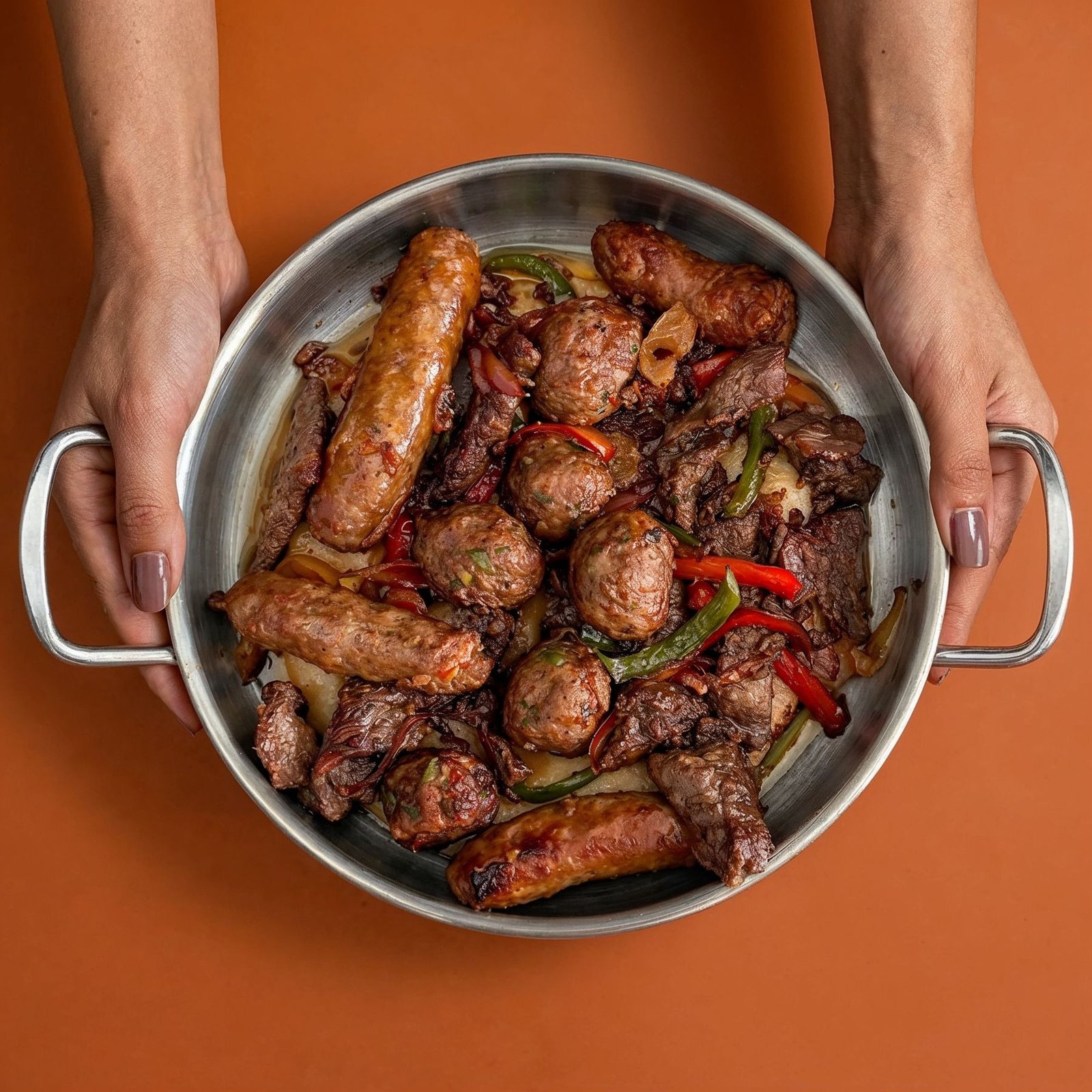
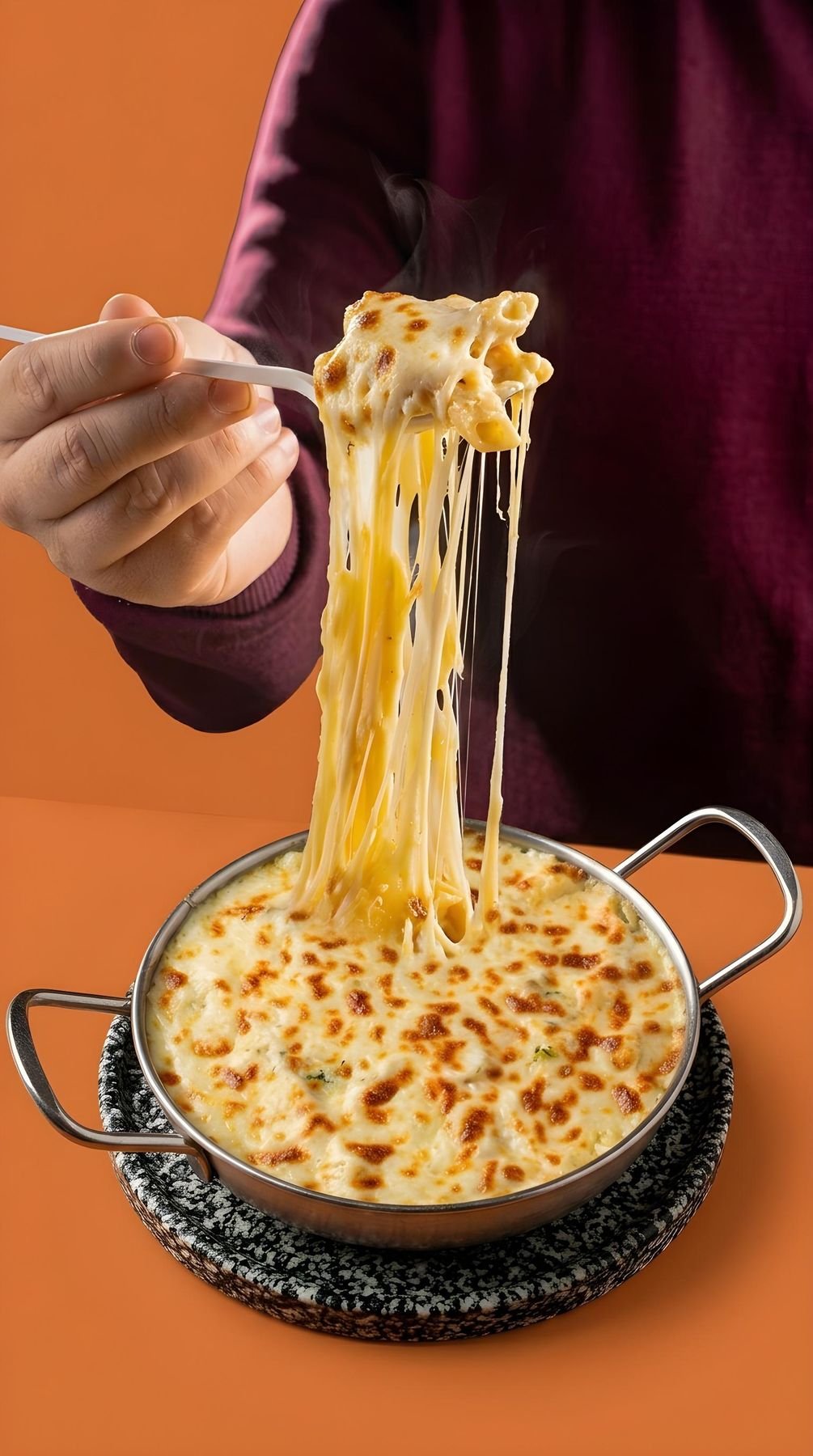
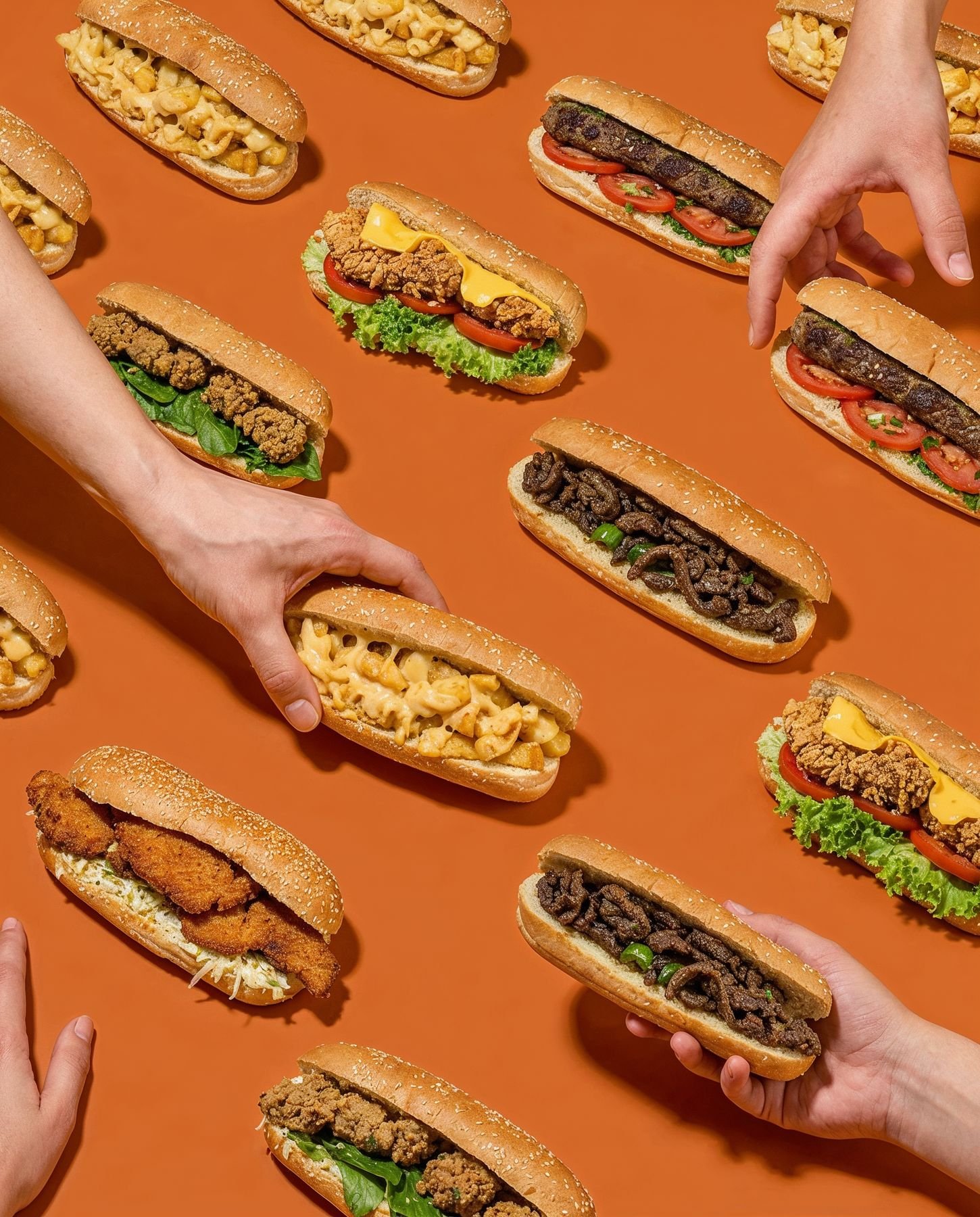
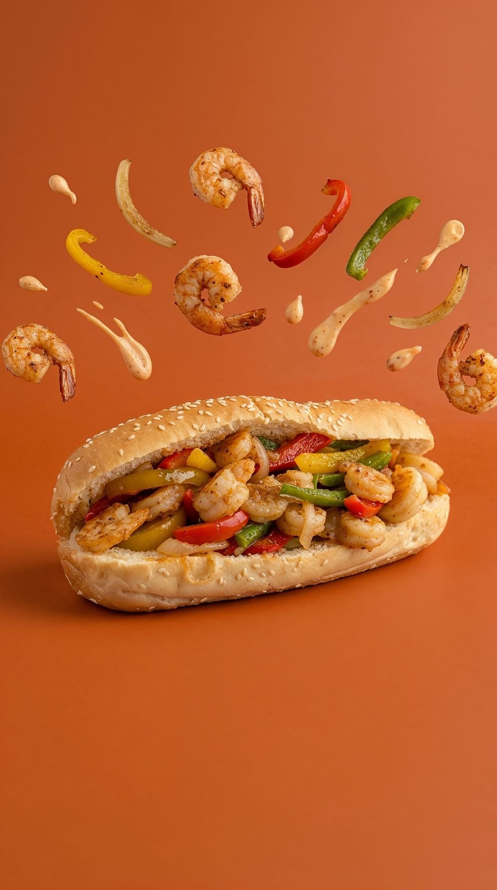
AI product photography
Product shots directed with AI tools on the brand orange, used across the menu and social media.
Next project
Moharram Bek
Need a brand that looks this sharp?
Let's talk